 (Image via
The allure of rural living isn't just about fresh air and open spaces; it's about a distinct visual language that whispers rather than shouts. It’s a design ethos born from practicality, inspired by the landscape, and worn in by generations of hard work and quiet evenings. Unlike the trend-driven frenzy of urban design, the aesthetic of rural simplicity is grounded, timeless, and effortlessly comforting. It doesn't rely on flashy accents or high-contrast drama. Instead, it leans on patterns and colors that feel as natural as a sunrise over a fallow field.
Embracing this aesthetic doesn't mean your home has to look like a museum exhibit of the 19th century. It’s about capturing the feeling of the country, the sense of ease, the connection to nature, and the beauty of utility. The colors are often muted, drawn directly from the earth and sky, while the patterns are classic, rhythmic, and familiar. They work together to create spaces that feel lived-in and welcoming, where nothing is too precious to be touched and everything has a story.
Whether you live in a farmhouse down a dirt road or a city apartment dreaming of pastoral peace, incorporating these elements can bring a sense of grounding calm to your environment. Here are five patterns and color palettes that perfectly capture the essence of rural simplicity.
The Quiet Dignity Of Sage Green And Cream
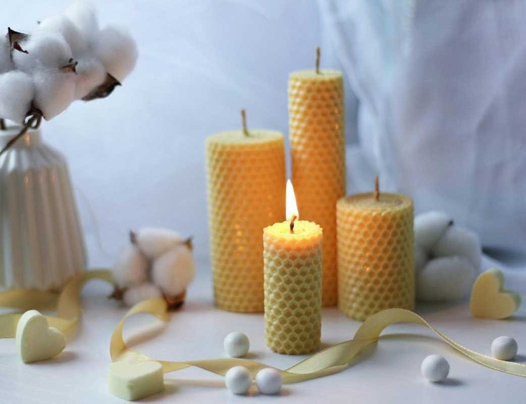
If there is a color combination that defines the pastoral landscape, it is the soft interplay between sage green and warm cream. This pairing is the visual equivalent of a deep exhale. Sage is not the vibrant, artificial green of a manicured lawn; it is the dusty, desaturated green of dried herbs, olive leaves, and lichen on a stone wall. It is a color that recedes rather than dominates, bringing the soothing properties of nature indoors without overwhelming the senses.
When paired with cream, not a stark, clinical white, but a white with yellow or brown undertones, sage becomes instantly cozy. It evokes the feeling of a farmhouse kitchen where herbs are hanging to dry and the morning light is filtering through linen curtains. This palette works exceptionally well on cabinetry, beadboard wainscoting, or even painted floorboards. It feels historical yet fresh, managing to look clean without feeling sterile.
This combination is inherently forgiving. Scuffs and wear on sage green cabinetry often look like character rather than damage. It creates a backdrop that allows natural wood tones and copper accents to shine. It is the color of the garden brought inside, a constant reminder of the growth and life happening just beyond the windowpane.
The Enduring Rhythm Of Gingham And Buffalo Check
Few patterns are as synonymous with country living as the check. From the small, tight weave of gingham to the larger, bolder scale of buffalo check, this pattern is a rural staple that has never gone out of style. Historically, these fabrics were practical; the woven checks disguised stains and mending better than solid cloth, making them perfect for aprons, tablecloths, and work shirts. Today, they bring a sense of nostalgic order and unpretentious charm to a room.
The beauty of a check pattern lies in its simplicity. It is just two colors crossing paths, yet it creates a visual texture that is both graphic and traditional. A buffalo check throw in black and white adds a masculine, cabin-like feel to a leather armchair. A soft blue and white gingham tablecloth instantly makes a dining area feel breezy and casual, like a summer picnic.
Here is how to incorporate checks without making your home look like a themed diner:
- Scale Matters: Mix a large-scale buffalo check on a rug with a smaller gingham on a throw pillow to create depth without clashing.
- Neutral Territory: Stick to neutral colorways like gray, beige, or navy to keep the look sophisticated rather than kitschy.
- Texture Play: Look for checks woven into wool or linen rather than printed on cotton for a richer, more tactile feel.
- Small Doses: Use checks as accents, curtains, napkins, or a single upholstered chair, rather than covering an entire room.
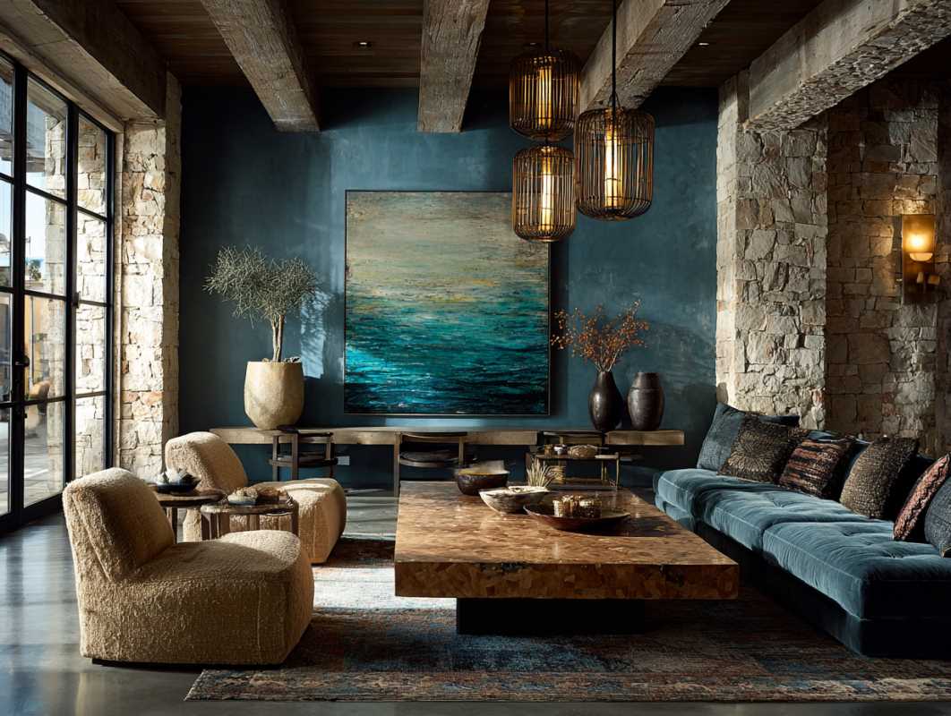
The Melancholy Beauty Of Stormy Blue And Charcoal
Rural life isn't always sunny meadows and blooming flowers; there is a beautiful, moody side to the country as well. Think of the deep, bruised purple-blue of a storm front rolling over the hills, or the dark, smoky charcoal of a woodstove. These deeper, moodier hues reflect the rugged reality of nature and provide a stunning counterpoint to the lighter, airier colors often associated with farmhouse style.
Using stormy blues and charcoal grays adds weight and sophistication to a room. These colors are grounding, creating a sense of shelter and enclosure that is perfect for bedrooms, studies, or cozy living rooms. They mimic the shadows of a dense forest or the deep waters of a lake. When used on walls, they make a space feel intimate; when used on furniture, they hide dirt and wear while looking undeniably elegant.
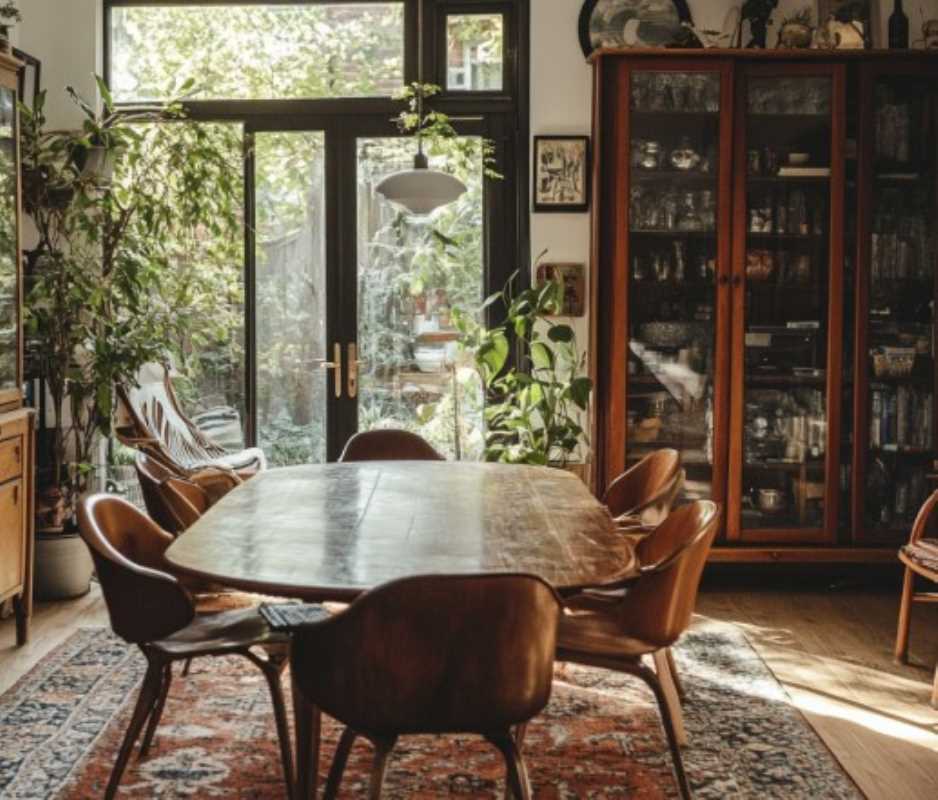
This palette pairs beautifully with raw materials. A charcoal wall makes the grain of a pine table pop. A deep navy sofa looks incredible against a white shiplap wall. These colors prevent a country interior from feeling too saccharine or sweet. They add a necessary edge, a reminder of the wilder, untamed elements of the rural landscape. They suggest a home that is sturdy enough to weather the storm, providing a safe haven when the winds pick up outside.
The Delicate Nostalgia Of Ticking Stripe
If checks are the workhorse of rural patterns, ticking stripes are the refined, quiet cousin. Originally used to encase mattress filling (hence the name), ticking fabric is characterized by a tightly woven herringbone or twill weave with narrow, repetitive stripes, usually in muted indigo, black, or red against a cream background. It is utilitarian in origin but elegant in execution.
The appeal of ticking stripe lies in its subtlety. From a distance, it almost reads as a texture or a solid color. It is only up close that you see the fine, rhythmic lines. This makes it an incredibly versatile pattern that can be used in large amounts without overwhelming a space. It works beautifully for bedding, slipcovers, and window treatments, adding a layer of visual interest that feels tailored but not stuffy.
Ticking stripe embodies the concept of "make do and mend." It recalls a time when fabrics were woven to last a lifetime. It brings a vintage, heirloom quality to a room, suggesting that the items within it have been collected and cared for over generations. It pairs effortlessly with florals, checks, and solids, acting as a neutral pattern that bridges the gap between different styles. It is the visual equivalent of a handwritten letter, personal, classic, and full of quiet grace.
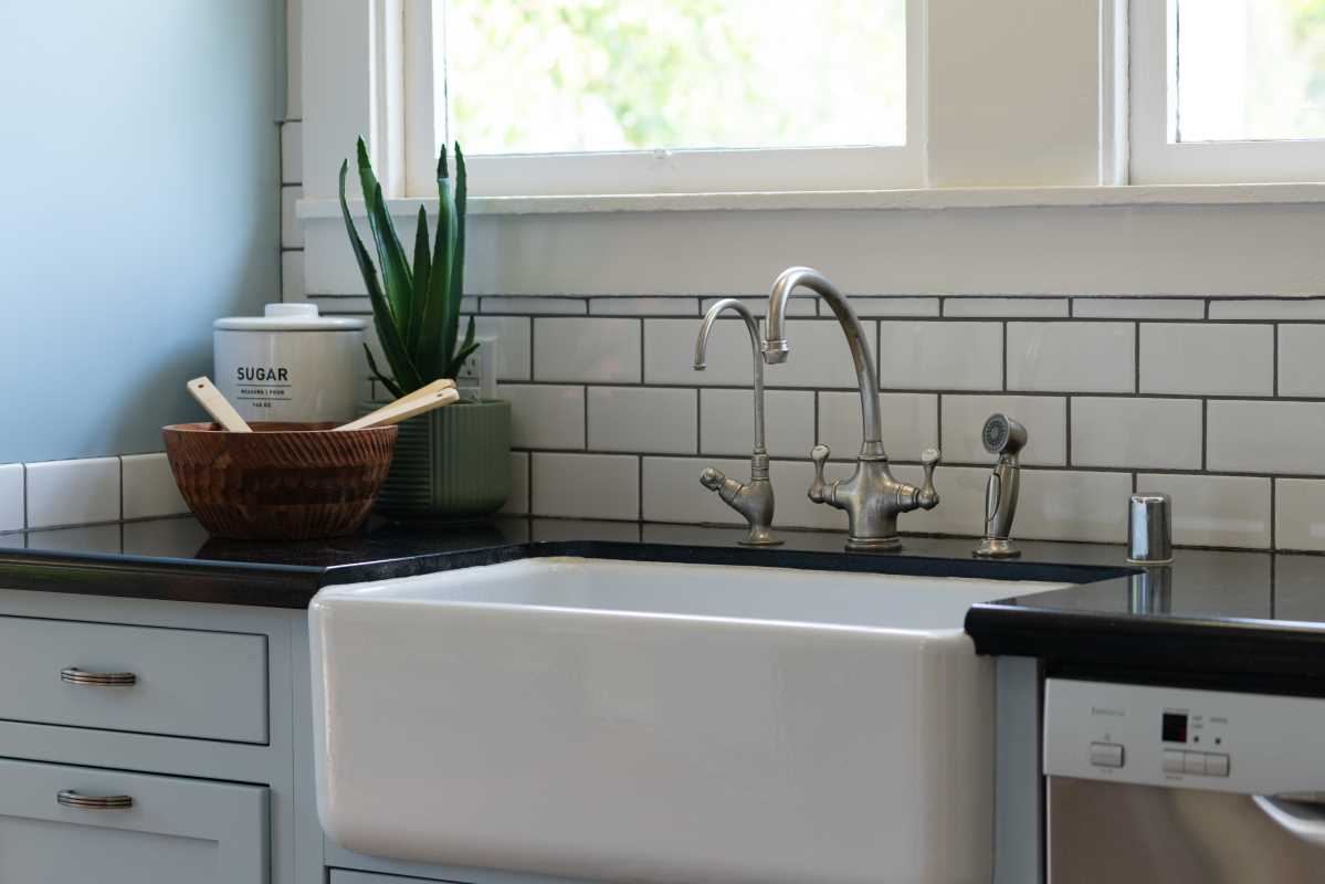
The Earthy Warmth Of Terracotta And Ocher
Finally, we turn to the colors of the earth itself. Rural living is inextricably linked to the soil, and a palette of terracotta, rust, and ocher celebrates that connection. These are the warm, baked hues of clay, dried leaves, harvest corn, and sunset light hitting a plowed field. They are colors that radiate heat and welcome, banishing the chill of a drafty old house.
Terracotta and ocher bring a vibrant yet natural energy to a space. They are not the shouting neon oranges or yellows of the synthetic world; they are muted, dusty, and rich. A floor tiled in terracotta pavers instantly transports you to a rustic cottage. Textiles in rusty oranges or mustard yellows add a pop of warmth to neutral sofas and beds.
These colors work particularly well in spaces where people gather, like kitchens and dining rooms, stimulating appetite and conversation. They harmonize beautifully with green plants and dark wood, creating a palette that feels complete and organic. Using these earthy tones is a way of honoring the agricultural roots of country life, acknowledging the soil that provides sustenance and stability. They make a home feel grounded, vibrant, and deeply connected to the changing seasons outside the door.