Color is a powerful language that can instantly shift the mood of a room, a wardrobe, or even a brand identity. While vibrant, saturated hues have their place, there is a unique and lasting appeal to subdued palettes drawn from the natural world. These colors, the soft grey of a river stone, the muted green of a forest floor, the warm beige of a sandy dune, carry an inherent sense of calm and authenticity. They connect us to the grounding, restorative power of nature, creating spaces and styles that feel both timeless and deeply personal.
Choosing a nature-inspired palette is about more than just picking pretty colors; it is about capturing a feeling. It is about translating the quiet hush of a misty morning or the gentle warmth of a sun-bleached shoreline into a tangible aesthetic. These palettes work harmoniously because they are borrowed from landscapes that have been perfected over millennia. This guide explores five subdued color schemes that reflect a life lived in tune with nature, offering practical ways to weave their quiet beauty into your daily life.
The Quiet of the Coastal Mist
Imagine a coastline on an overcast morning, where the sea, sky, and sand blur into a seamless gradient of soft, cool tones. This palette is defined by muted blues, foggy greys, pale driftwood tans, and the creamy white of seafoam. It is a color scheme that speaks of tranquility, space, and quiet reflection. These colors are inherently calming, working together to create an atmosphere that is airy and uncluttered. They are perfect for creating serene living spaces, particularly in bedrooms and bathrooms where relaxation is the primary goal. The lack of high contrast allows the eye to rest, fostering a sense of peace.
To incorporate this coastal mist palette, focus on layering different shades of grey and blue to create depth. In home decor, combine a light grey wall with a slate-blue sofa and linen curtains the color of pale sand. In fashion, this translates to a classic, sophisticated look, think a grey cashmere sweater paired with light-wash denim and a trench coat. For branding, this palette communicates trustworthiness, stability, and calm professionalism. The key is to introduce texture, weathered wood, woven fabrics, or seagrass, to prevent the soft colors from feeling flat and to mimic the varied surfaces of the shoreline.
The Warmth of the Sun-Bleached Desert
The desert landscape is often misunderstood as barren, but its palette is incredibly rich and warm. This color scheme draws from the sun-baked earth, featuring shades of terracotta, ochre, muted blush, and sandy beige, anchored by the deep, shadowy brown of canyon rock. These are earthy, grounded colors that evoke a sense of warmth and history. They feel both ancient and modern, making them incredibly versatile for design. This palette is ideal for creating inviting, cozy social spaces like living rooms and kitchens, where the warm undertones encourage gathering and conversation.
Bringing the desert palette into your life is about embracing warmth and texture. In your home, consider an accent wall in a soft terracotta or use blush-toned linens and pillows to soften a neutral space. Natural materials like clay pottery, leather, and rattan are essential companions to these colors. In fashion, this palette translates into bohemian-chic styles featuring linen trousers, suede jackets, and woven accessories. For brands looking to convey authenticity, craftsmanship, and a connection to nature, these earthy tones are a perfect fit. They feel honest, warm, and deeply connected to the land.
The Depth of the Forest Floor
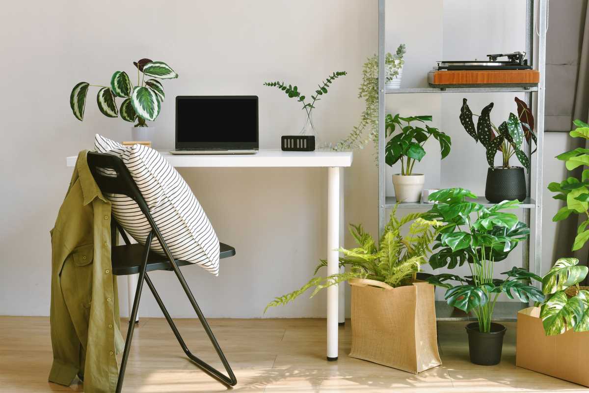
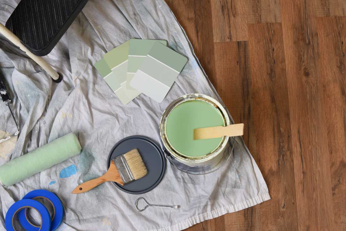
Step into a dense, old-growth forest, and you will find a palette that is deep, complex, and full of life. This color scheme is built on a foundation of muted greens, from moss and olive to the deep teal of pine needles, complemented by the rich, loamy brown of damp earth, the grey of lichen-covered bark, and faint hints of mushroom beige. It is a palette that feels protective, grounding, and restorative. These colors are known to reduce stress and promote a sense of well-being, making them perfect for creating spaces of concentration and rest, such as home offices, libraries, or snug living rooms.
To use the forest floor palette effectively, embrace its moody and enveloping nature. Paint a room in a deep olive green to create a cozy, den-like feel, and balance it with natural wood furniture and brass accents that mimic sunlight filtering through the canopy. In clothing, these colors create a look that is sophisticated and understated, pairing well with natural fibers like wool and tweed. For brands in the wellness, sustainability, or outdoor industries, this palette instantly communicates a connection to nature, health, and thoughtful living. It feels stable, nourishing, and wise.
The Simplicity of Alpine Stone
High above the treeline, the alpine landscape offers a lesson in minimalist beauty. This palette is inspired by the stark elegance of mountain rock, featuring a spectrum of greys, from light slate to deep charcoal, accented by the crisp white of snow and the subtle blue-green of hardy lichens. It is a clean, structural, and sophisticated color scheme that speaks of strength, resilience, and clarity. These cool neutrals create a backdrop that is modern and serene, allowing architectural details or a few carefully chosen objects to stand out. It is ideal for minimalist interiors and for brands that want to project competence and precision.
Incorporating the alpine stone palette is an exercise in restraint. In home decor, use varying shades of grey to build a layered, monochromatic look, and introduce texture through concrete, stone, and metal. A single pop of color, like a vibrant green plant, will have a powerful impact against this neutral canvas. In fashion, this palette is the epitome of chic minimalism, think a well-tailored charcoal suit or a structured white shirt. For tech companies, architectural firms, or financial institutions, this color scheme conveys a sense of enduring strength, intelligence, and sleek modernity. It is strong, uncluttered, and timeless.
The Softness of the Autumn Meadow
Picture a meadow in late autumn, after the brilliant foliage has faded but before the first snow. The palette here is soft, subtle, and full of gentle warmth. It is composed of the golden tan of dried grasses, the muted purple of late-season asters, the dusty rose of wilting seed heads, and the soft brown of fallow fields. This is a nostalgic and poetic color scheme that evokes a sense of gentle transition and quiet beauty. It is less dramatic than the fiery colors of early fall, offering a more subdued and sophisticated take on the season. It is perfect for creating rooms that feel romantic, comfortable, and a little rustic.
To bring the autumn meadow into your home, look for textiles in faded floral or grass prints, and combine tones of dusty rose and gold. Materials like dried wheat, pampas grass, and unbleached linen are natural complements to this palette. In fashion, these colors lend themselves to soft, flowing silhouettes and cozy layers, a mauve sweater over a cream-colored dress, for example. For artisanal brands, wedding designers, or anyone looking to create a gentle, heartfelt impression, this palette is ideal. It feels personal, graceful, and infused with the quiet magic of the changing seasons.
 (Image via
